Showing posts with label art. Show all posts

Thursday, June 30, 2016

Sketching: Life is Strange - Partners in Time

Life is Strange - Pertners in Time
Also available in my DeviantArt.


Quick introduction for those who haven't ever heard of the game: Life is Strange, Square Enix. Episodic choose-your-own-adventure mystery with time travel. The left one is Max Caulfield, our heroine, and the right one, Chloe Price, her best friend (or, in one plot, lover).

Life is Strange. What a compelling series, what an emotional ending right in the middle of the finals I had several weeks ago. When it was all done, I did this. I still can't get over this game. Spoiler: I was too sorry for Max, which was why finally I decided to save Chloe instead of the whole town.


It was actually done before the Half-Blood Magus, but oh well, just had the time to write this up. This scene from the second episode hit me as marvelous, and I have been itching to draw that up. At first, I thought of switching around the positions to make it a little bit more original, and perhaps, interesting.


...Which was why I did a preliminary sketch. Turned out quite unnecessary in the end, as I would mostly copy by eye.


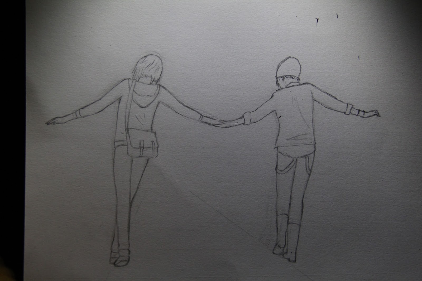
Starting with the all-important leg placement, I worked my way up Max, then started on Chloe. Linking their hands was quite a nightmare in positioning, it turned out, and to manage the proportions, Chloe's feet got moved quite some. Another ordeal considering I press down hard with HB. The paper's getting fuzzy.


After that, I thought it was time to shade. Starting from Max's top, this time. That part was quite quick and easy. I think that time I used only my HB and 2B, as my 4 and 6B were spent. 


I thought that actually, their hands weren't linked up good enough--so there I went again, redoing the top. To tell the truth, I actually think the subjects here are too small to be convenient in shading them.


But shaded them I did. Chloe also wasn't that much of a fuss to shade, apart from the detail being too small to bother. 

Perhaps it was just about inspiration and will: Life is Strange was inspiring enough so that I wanted to get these two shaded, seeing their final form as quick as possible. So, what came next wasn't done as wholeheartedly, to be very honest.


Looking back, I shouldn't have redid the linework over the shading, even with a 2B. Nor should I try to make a background in my quite lazy state--but I did it anyways.

After shading, I continued to make the background, against my better judgement. Perhaps the lack of a lumber pile next to the rails made the piece look too natural, not some rural part of Arcadia Bay.


As I foretold, the background ended up messy. I may get away with that being a personal choice, but I just wanted the piece to finish quickly. It took over five days, over around about six hours, probably. I just used my camera to take this picture and edit it, as I wanted to try comparing this with my usual scans. Only edited the contrast and touched up; no major surgeries needed.

Result? Characters good. Perhaps a little bit skewed to the right. Background's unworthy to look at, but whatever. I'll leave it to you to judge the final result.

By the way, I missed many weeks without a post. Haven't had the will to do one until now, I guess. This field of stars doesn't seem like going anywhere for me.

___
Life is Strange (C) Square Enix and Dontnod Entertainment.

Monday, June 20, 2016

Sketching: The Half-Blood Magus

The Half-Blood Magus.
Also on display in my DeviantArt.
The holidays being here, I shall continue to cook this idea in my head: a grand plan for an epic story. It is the continuation of this piece done long ago, and this guy will be the main character, the best friend of the Elf-King: the half-elf, whom I shall call Leon, as the Fall of an Empire's Leon would most likely go in indefinite hiatus. 

So, this Leon: an orphaned half-elf, who joins the Magi (I won't go into detail on that). Most could only harness magic only with staves, but this guy is one of the few who could do so without. Perhaps like Skyrim's bound weapons.


I already did some planning on the first pose, when I realized that it was quite close to the Assassin's Creed one I did before. Meanwhile, I was doing a Life is Strange piece... so this sank into hiatus. Man, I would use that word often.


Two of my references: Mannfred von Carstein for the pose. I really wanted to play that game but can't... technical reasons.

And Final Fantasy XV's Noctis. Handsome guy. Used him for the looks, naturally. Also would want to play that game, though I would doubt it, for the same technical reasons. 


Thus, back to the drawing board. Several poses planned before, and I straight off chose the one closest to Mannfred's pose.


First attempt, a bit disastrous. There was also a second try after that, however as I erased, turned out my eraser was quite dirty, and I would need a better eraser. So, a trip to the bookstore was arranged, and walked off with an eraser and 2H pencil to add to the collection.


That was more like it. Thinly sketching, then detailed it. 


Basically, that was my final sketch. Crosshatched in several places that I wanted to be darker, and I was off shading, from the usual top-to bottom with the HB and 2B. The planning and sketching took longest, where the shading only took around 2 hours from 5 to 6 hours, perhaps.


Finally, the traditional part was done. I scanned it, and tampered with the contrast and tones, and vigorously edited his face.

The result? Yeah, I'm satisfied. Halfway between manga and realism. But I'll leave it to you for opinions.

Wednesday, June 1, 2016

Sketching: Bungou Stray Dogs - Call A Name


Please, see this in my DeviantArt.

I shall simply feature this artwork here. Well, I forgot to take process pictures along the way, so this was the final product.

Bungou Stray Dogs was quite interesting, as you could tell from my reviews each week. In my boredom several weeks ago, I decided to draw these two: Atsushi and Dazai, the two most charming, fit to be drawn.

The ending song, Namae wo Yobu yo was a nice tune, and the art was just begging to be drawn. Actually, I did just copy down these references, detailed a bit here and there.


I simply moved Dazai over from the original position, made the papers in a circle, and removed villain Akutagawa from the picture.

It had been a while since I've drawn anything, and I thought that I could just practice shading here, plus composition. Used my usual from HB until 4B. As usual, HB was the most used, but 6B wasn't used at all, as the drawing was quite light.

This took around about four hours, I think. Same old-same old, with the outline first, doing Atsushi first, then Dazai, and retraced the lines for a dark outline. Then just a quick brush in Photoshop to clean up the piece from my scanner.

Not much to comment by me, here. Atsushi turned quite nice, but Dazai... a little too melancholic, perhaps. 

Monday, April 25, 2016

Sketching: Edward Kenway, Assassin's Creed IV

I've finally, after some good long while playing, finished the main story arc of Assassin's Creed IV: Black Flag. So, naturally, I made some form of art of our dear Edward Kenway.
"We Could've Been Heroes." -Edward Teach
Also on display in my DeviantArt.
This whole piece took around six or seven hours or thereabouts. Not on the level of Kylo Ren, to be sure, as this was made on half an A4 paper. And even then the image only occupied the center right.


This image was used for reference, and I added some more for the right hand, as I decided to mix up the pose a little bit.


This was just a sketch made late at night. I later changed it up and ended by simply erasing everything completely.


The first sketched done was in HB pencil. crude, and only halfway done when I started shading in.


Now this was the face of an overgrown monkey. I would have changed that many times by the time I was done.  That wasn't as bad as how it was at first, though.

I used my 6B very much here, and HB for the lighter parts. After that, brush everything with a cotton swab. Also, in the meantime, I worked my way downward with the sketch.


Changed up the face a bit, and proceeded with the collar. The skull pin proved to be something annoying.


Then, I went in and shaded in the hand and gun. Actually, I didn't need to edit this out much at all.


I detailed the vest and flintlock in the belt. That part I needed to deviate from the reference, for the in-game shot of Kenway didn't have straps for the guns. I think it was also at this time I started to use the 2B more, and also tampered with the face (yet) again.


The rest was quite straightforward. The lower part of the vest were only hampered by my schoolwork.


Then, the belts and clothes were shaded in. That also wasn't too bad. Also, having learned about the problem with the guns' straps, the lower flintlock was a breeze.

All that was left was the arm. I decided to leave it at that and add some smoke effects.

Then, on to Photoshop to balance out the contrast, and I moved the eye a little bit to make it more striking. And that was all.

The result? The face was strange but at the very least recognizable (according to my friends). The smoke needs work. But that was all. And that is all from me for now.

___
Assassin's Creed IV: Black Flag is a game by Ubisoft.


Tuesday, April 5, 2016

Sketching: Kylo Ren

This was something I made quite some time ago, for over more than ten hours.

It was more than three months after watching Star Wars: The Force Awakens, and I remembered that I haven't drawn anything for it. Thus, I picked Kylo Ren: the most interesting character, relatively, for there was a lack of favorite characters there. This is it, my first fray into realistic sketching, which I thought might better suit me:

Kylo Ren. Also on display in my DeviantArt.


This image was what I found for reference. I tried to recreate the detail, textures, and lighting the best I could, but first, I did the lineart.


Not too thick, a HB pencil is enough. Tried numerous times to start from the top, but decided to do the bottom part of the mask first. Actually, I revised that part many times after I started shading.

Also, as you could see from the second image, I started shading from the dark inside of the hood. Perhaps the 6B I used might have been too light, now that I look at it. I may need the 9B.


Then, I decided that the lower left section would be the least pain to do, so I went ahead and finished it up to the cheek.


Now, the top part must be focused more on the reflected light on the metal. Actually not the most difficult part, actually.


Now, actually I got carried away here that I forgot to take some pictures.

What I did first was testing out the lightsaber's glow, then continued with the upper part of the mask, saving the big empty space below for later. I still think I could make the lower part of the mask a little bit better.


After quickly shading the coat and giving it some backdrop, I scanned, and cropped it to size. I fixed the contrast and tones, also added a tinge of red color balance, and pretty much we're back to the finished image.

___
Star Wars, Star Wars: The Force Awakens (C) Lucasfilms.

Sunday, February 28, 2016

Photography Class: Panning Tips

My mid-term tests shall start tomorrow, thus I'll give some content other than reviews for today.

One of the most impossible tasks for me a week ago: panning. Putting it simply, you'll point the lens , focusing on and then following a moving object and the background shall blur.

However, doing so was anything but simple. As people learn best from mistakes, I'll just give an idea of how a panning shot could look like, then give my failed shots. Lots of them, in fact, as I took more failed shots than good ones. All pictures are taken with my Canon EOS 600D on 19 Febuary.

Edited on Adobe Photoshop CS6
Shutter speed: 1/40 s
Aperture: f/13
ISO: 800
There we go, captured the moment of two GrabBikers conversing in the middle of the road.

Such is the safety in Indonesia. But anyway, thank you for the opportunity, Sirs.

That was the product of lots of trial and errors; mostly errors. The only frustrating thing in taking panning pictures is to actually stay focused on the object, making it sharp and panning only the background.

One important thing to make your photos pan is to increase your shutter speed to around 1/40 seconds and above, and make sure your hand stays steady during panning. Maybe rotating on a tripod would work better.

Shutter speed: 1/40 s
Aperture: f/22
ISO: 800
Right, this one is not that bad: a security guard patrolling on his bike. See that the car on the background would be better off if it was passing the bike, more to the left of the picture. We can't control the conditions; this is not still life.

One thing to save some pain and immediately capture a good moment is to let your camera judge the aperture needed by setting it at time-value (Tv) for Canon, Pentax and some others, or shutter priority for Nikon, Sony, Olympus, and others. That way, you'll set the speed yourself and get the brightness needed by letting the camera automatically adjust the aperture.

Shutter speed: 1/25 s
Aperture: f/22
ISO: 800
This was the first proper panning I got, and it's not even that meaningful a scene.

Now, notice how small the bike is? Welcome physics. The longer the focus is, the more you'll move the image by rotating it at a certain angle. Sometimes, keeping the focus length lower could be better for aiming the camera properly.

Shutter speed: 1/25 s
Aperture: f/25
ISO: 800
Now, one of my failed shots. It seems I panned too slowly this time; I think so, at least.

Remember that in autofocus, the camera needs some time to scan and focus the image. However, unless you could focus faster than the auto, do use this mode to save time.

Shutter speed: 1/25 s
Aperture: f/22
ISO: 800
I think, for this one I panned to quickly. Such was the difficulty at getting a good image; though if this is the style you're looking for, do go for it.

Oh and now, bikers do not use helmets. Who should change, really?

Shutter speed: 1/25 s
Aperture: f/25
ISO: 800
Again, panned too quickly. Also, usually it should be much better if we could capture the whole object in the picture, not cutting it in half like this car.

Shutter speed: 1/25 s
Aperture: f/13
ISO: 800
Now, I have no idea what happened here. It seems the image is focused more on the driver's cab. I think, I zoomed in (increased the focus) a little as the photo was taken. Only if the driver was more focused...

There we go, some tips from my failures in panning. I still have much to do, what with tomorrow's first mid term test. So long.